Exploring Mandelbrot parameter space - part 1
Some time ago, I presented python code able to draw the so-called Mandelbrot set, a fractal image with intriguing properties. Recently, Benoit Mandelbrot passed away. I want to pay homage to his work by digging into more details of his eponymous image.
In the previous post, we observed that a parameter is crucial for the resulting image: the "starting point", described in my code as (a, b) or, in the second part of the post, z~0~. In traditional Mandelbrot, this starting point has coordinates z~0~ = (0.0, 0.0), and with this input, the Mandelbrot set is obtained.
After this first evaluation, I went further on by showing how the Mandelbrot Set changes when this point z~0~ is modified from the original value (0.0, 0.0). The animations I provided show what happens to the Set when choosing different z~0~ points, such as (1.0, 0.0) or (-2.0, 0.0), for example. The first animation showed plots with z~0~ = (a, 0.0), with a going from -3.0 to +3.0 with a step 0.1. In other words, I produced a Mandelbrot image for z~0~ = (-3.0, 0.0), another one for z~0~ = (-2.9, 0.0) and so on, until z~0~ = (3.0, 0.0). In the second animated picture, I did the same for points like z~0~ = (0.0, a) with a on the same interval and step. Finally, the last animation shows how the Mandelbrot behaves with starting points (a, a), again with the same interval.
This exploration of the bond between a possible value for z~0~ and the resulting Mandelbrot has interesting properties. Let's try to see visually what's going on. Imagine there's a plane of possible values of z~0~

For each point on this plane, there's an associated Mandelbrot Set image. The traditional Mandelbrot is associated to the origin of this plane. With the experiments I did by changing the starting point, I moved along the x axis in the first animated picture, along the y axis in the second animated picture. For presentation purposes, I could choose to stick the actual Mandelbrot images on this plane, imagining that the lower left corner of each image indicates the z~0~ point that image comes from
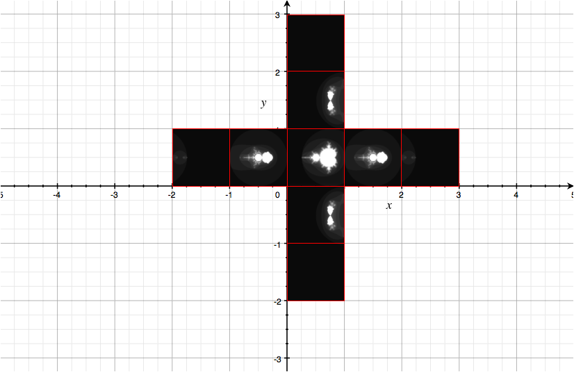
As I already stated, the lower left corner "points to" the z~0~ point. You see, along the x axis, images for the cases (-2, 0), (-1, 0), (0,0), (1,0), (2,0). Along the y axis, you see (0, -2), (0, -1), (0,0), (0,1), (0,2). These are only a few of the points you could actually choose. Any point of the plane has an associated Mandelbrot.
My plan for this post, is to explore the plane, that is, to see how the Mandelbrot image changes as I select points like (0.34, 0.12), among others. In order to achieve this, I need to do exactly what I did above, but with smaller images with respect to the size of the "graph paper" image. The results are quite interesting
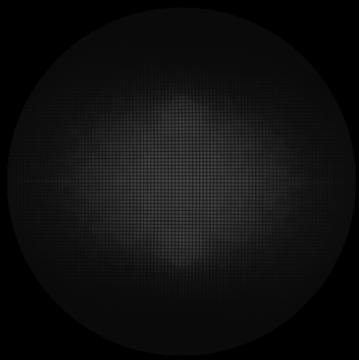
The image above shows the z~0~ plane. It is built with the same concept given for the very simple case above: many Mandelbrot images, whose corner refers to the actual point on the plane. To demonstrate you this is the case, if I zoom in what I see is this
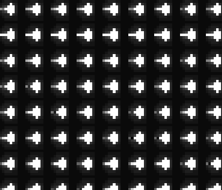
A collection of very tiny, very low resolution Mandelbrots, each of them associated to a specific point of the z~0~ plane. I had to keep the resolution of each individual Mandelbrot to very, very small. What I did takes a lot of computer time.
The interesting fact about this plot is that it contains fractal features as well! Looking carefully on the left, and playing with the zoom, I obtained this image

I suggest you observe it from afar. The ramifications typical of fractals will be evident. Every small white dot in the above image is a "mini Mandelbrot" image, whose white points allow us to see something, but not very clearly. Can we improve the situation? Let's see.
I developed a new program. Instead of placing tiny Mandelbrot images like post-it notes on a board, for each point of the z~0~ plane I generate the corresponding Mandelbrot, then I count the number of white points it has, and I color the pixel of the z~0~ plane of a different shade, depending on the amount of "whiteness" showed by the corresponding Mandelbrot. The result ?
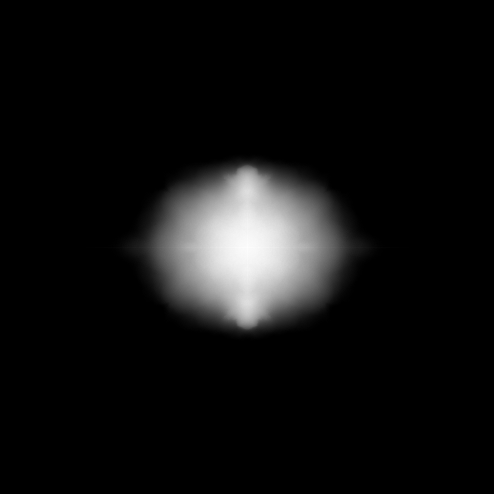
The above image was created from the number of totally white pixels (scaled from 0 to 255 against the maximum) in a series of 100x100 Mandelbrots, one for each pixel. Not as fancy as I hoped for. I tried to play with color balance to no avail. I think there are two problems. First: the small resolution (1000x1000 is not much). Second, the poor averaging strategy, leading to poor contrast. This plot required 48 hours of computation.
Trying to get better plots requires a lot of computational time to increase the resolution, but unfortunately I only have a laptop. This kind of problem can run parallel very efficiently, but even if I put my second core to work, I won't get very far. The next step is therefore to get a better plot at a reduced cost, eventually accepting some compromises. Stay tuned.