Building my own keyboard - Part 1
Recently I joined Makespace Cambridge. It’s a community workshop with a wide availability of tools, such as 3d printers, laser cutters, milling machines and so on. The initial motivation was to gather python enthusiasts interested in exploring more complex topics in the language, but this is a story for another time. In any case, with my membership, I began to appreciate the number of tools available, so I decided to come up with a project. But which one?
I suddenly realised I never really had a pleasant experience with keyboards. I am deeply dissatisfied with the current offer, and even advanced or custom keyboard offers were not great. The Kinesis Freestyle and the Unicomp clicky click keyboard got me quite far, but I need to go further. Hence the Keymine project was born, at least in my head.
Spoiler warning: I quickly found out that making a keyboard is not an easy task, especially if, like me, know very little about electronics. But we are not here for easy tasks. It is also very expensive. I estimated it will cost me up to 500-600 pounds, including the prototypes.
What do I want from a keyboard?
So, what’s the ideal Keymine? It must have
- Two halves. My wrists demand it. The Kinesis Freestyle is a great model that served me well, but it has its limitations. additionally, it will save me a lot of money in PCB design.
- No numeric keypad. It’s a waste of space, I never use it, and forces me to move the hand and arm too much to reach the mouse.
- No useless keys. Enough with the caps lock, the print screen, scroll lock, pause.
- Additional keys: I program in R, so I would really love a key that sends the “<-“ assignment.
- No split keys for up-down cursor. That thing is pure garbage.
- Programmable displays to show up-to-date information (e.g. build status)
- Fully programmable macro keys on the left hand side. Basically a keybow pimoroni integrated in the keyboard. Bonus point if the keys also have an OLED display (but they are pricey)
- Excellent but quiet touch ergonomics. We don’t want to drive colleagues crazy.
- Coolness factor. Must look cool somehow.
Layout
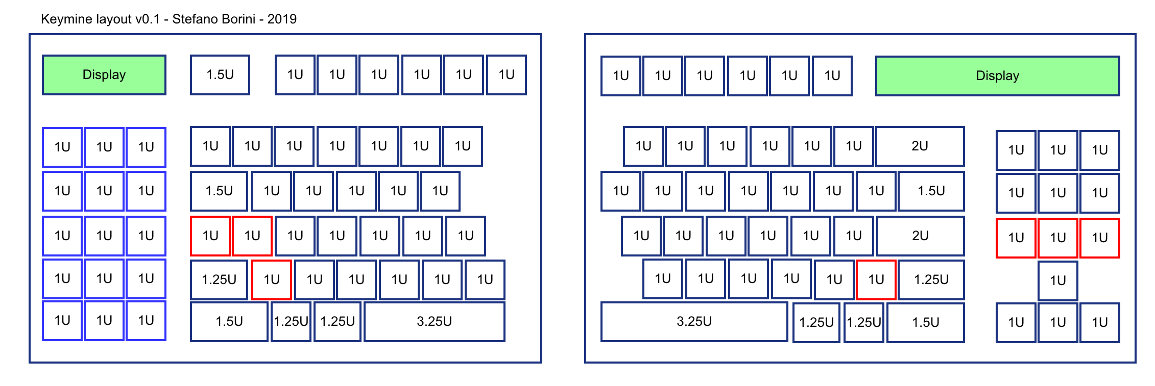
Basically, this is the layout I am aiming for

In other words, I want a mix of the best parts of ANSI and ISO layouts, with short shifts, horizontal Enter, and additional keys put to good use. In particular, I’d like to replace the useless Caps Lock with two keys.
Sadly, I quickly discovered that this is not a good design. If we assign 1U for the size of a standard button (approx 2 cm), the keyboard has the following sizes:

Which is unfortunately incorrect, for a series of reasons:
- Despite the breakdown of the keyboard in two halves, the total row size must be consistent. In this keyboard it is 15U. Row 0 (the Esc/Fxx row) is not important. Row 1, 2, 3 (123, QWE, ASD) do satisfy this requirement, but not row 4 (ZXC) and row 5, (Ctrl/Win/Alt), which counts at 14.5.
- Between row 2 and 3d the horizontal offset between Q and A must be 0.25, and between A and Z must be 0.5, for human ergonomics. This is completely not satisfied in my layout.
- keys that are used with the pinky finger need to be at least 1.25U, as the hand is less accurate with those fingers. This means we can’t have two 1U keys to replace the Caps Lock (which, due to point 2 above, must be 1.75)
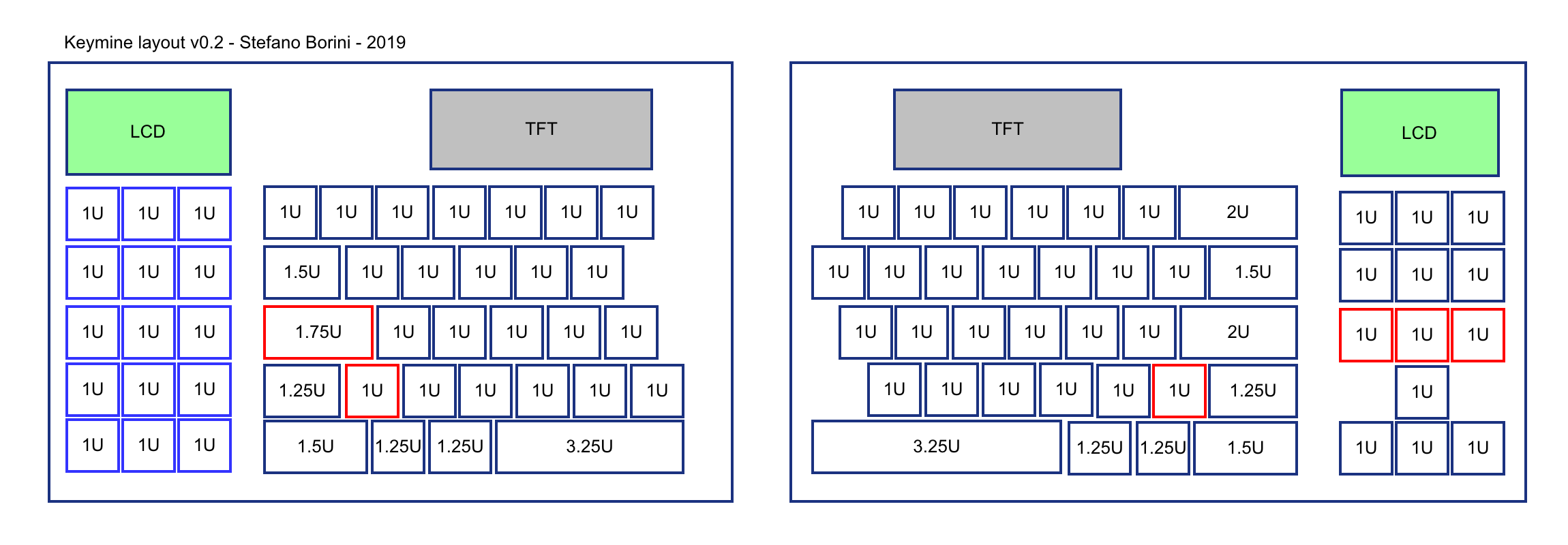
This means, I don’t really know what to do with the Caps Lock. I can definitely shorten the Shift key from the standard 2.25 to 1.25 and obtain an additional key, but for what concerns the Caps Lock the situation is more complicated. It must go, it’s useless, but it also must be a single 1.75 key. Some people map Caps Lock to Esc, but I don’t buy it: I would not be muscle compatible with general QWERTY and have to retrain 20+ years of muscle memory while vimming.
An option would be to replace the Caps Lock with a “Function” key. The idea is that I could use a combination of F and 1 to obtain F1. Sounds appealing and would get rid of the Caps Lock and 12 Function keys. However, the Esc needs to stay in the old position, and would basically become a lonely button up there. Could I put a long visual strip up there? Maybe, but it is not going to be easy to get one, and pricey if I do.
If I could learn to love Esc as Caps Lock, I might actually obtain this rather interesting design.

In logical terms, it kind of make sense. Enter is to accept the current task. Esc is to abort the current task. It would be beautiful if they were on the exact opposite sides. So be it. I’ve been wrong for 20+ years, and it’s time to move on.
With the above layout, I’ll leave out the F keys entirely. They will be mapped to the lateral keypad, which will basically be a three tabs multipage, like I have done to my keybow with keybow-pager